Kinh doanh - Marketing
Kinh tế quản lý
Biểu mẫu - Văn bản
Tài chính - Ngân hàng
Công nghệ thông tin
Tiếng anh ngoại ngữ
Kĩ thuật công nghệ
Khoa học tự nhiên
Khoa học xã hội
Văn hóa nghệ thuật
Sức khỏe - Y tế
Văn bản luật
Nông Lâm Ngư
Kỹ năng mềm
Luận văn - Báo cáo
Giải trí - Thư giãn
Tài liệu phổ thông
Văn mẫu
Tài liệu HOT
Tìm
Danh mục
Kinh doanh - Marketing
Kinh tế quản lý
Biểu mẫu - Văn bản
Tài chính - Ngân hàng
Công nghệ thông tin
Tiếng anh ngoại ngữ
Kĩ thuật công nghệ
Khoa học tự nhiên
Khoa học xã hội
Văn hóa nghệ thuật
Y tế sức khỏe
Văn bản luật
Nông lâm ngư
Kĩ năng mềm
Luận văn - Báo cáo
Giải trí - Thư giãn
Tài liệu phổ thông
Văn mẫu
Thông tin
Điều khoản sử dụng
Quy định bảo mật
Quy chế hoạt động
Chính sách bản quyền
0
Trang chủ
Công Nghệ Thông Tin
Đồ họa - Thiết kế - Flash
Learning Web Design Third Edition- P35
TAILIEUCHUNG - Learning Web Design Third Edition- P35
Learning Web Design Third Edition- P35:Everything you need to know to create professional web sites is right here. Learning Web Design starts from the beginning defining how the Web and web pages work and builds from there. By the end of the book, you'll have the skills to create multi-column CSS layouts with optimized graphic files, and you'll know how to get your pages up on the Web. | Page Layout Templates Layouts Using Absolute Positioning Absolute positioning can also be used to create a multicolumn page. The advantage is that the order of the source document is not as critical as it is in the float method because element boxes can be positioned anywhere. The disadvantage is that you run the risk of elements overlapping and content being obscured. This makes it tricky to implement full-width elements below columns such as the footer in the previous example because it will get overlapped if a positioned column grows too long. When working with absolute positioning remember that every element you position is removed from the normal flow. If content you expect to be at the bottom of the page is sitting at the very top it s because you positioned and thus removed all the elements above it that were holding it down. This is something to keep in mind while troubleshooting. Two-column with narrow footer Method POSITIONED Layout LIQUID The example in this section creates a right sidebar column using absolute positioning. The resulting layout is shown in Figure 16-12. Note that the footer design has been modified for the sake of simplifying the template full-width footers are problematic as mentioned earlier . Footer appears only under the main content. Figure 16-12. Two-column layout with absolute positioning. 326 Part III CSS for Presentation Page Layout Templates The Markup div id header Masthead and headline div div id main Main article. div A div id extras List of links and news div div id footer Copyright information div Markup Notes This style sheet absolutely positions the extras div element against the right side of the page and 100 pixels down from the top to leave room for the header element. The main content div is given a right margin wide enough to make a space for the newly positioned box. WARNING Because this template places columns a specific pixel measurement from the top it may not be appropriate for pages with headers that may .
Huệ My
41
10
pdf
Báo lỗi
Trùng lắp nội dung
Văn hóa đồi trụy
Phản động
Bản quyền
File lỗi
Khác
Upload
Tải xuống
đang nạp các trang xem trước
Bấm vào đây để xem trước nội dung
Tải xuống
TÀI LIỆU LIÊN QUAN
Thiết kế trang web bằng FrontPage 2003 part 1
28
179
0
Thiết kế trang web bằng FrontPage 2003 part 2
32
156
0
Thiết kế trang web bằng FrontPage 2003 part 3
32
166
0
Thiết kế trang web bằng FrontPage 2003 part 4
32
162
0
Thiết kế trang web bằng FrontPage 2003 part 5
32
173
0
Thiết kế trang web bằng FrontPage 2003 part 6
32
163
0
Thiết kế trang web bằng FrontPage 2003 part 7
32
168
0
Thiết kế trang web bằng FrontPage 2003 part 8
32
169
0
Thiết kế trang web bằng FrontPage 2003 part 9
32
168
0
Thiết kế trang web bằng FrontPage 2003 part 10
24
164
0
TÀI LIỆU XEM NHIỀU
Một Case Về Hematology (1)
8
461864
55
Giới thiệu :Lập trình mã nguồn mở
14
22635
59
Tiểu luận: Tư tưởng Hồ Chí Minh về xây dựng nhà nước trong sạch vững mạnh
13
10884
529
Câu hỏi và đáp án bài tập tình huống Quản trị học
14
10064
446
Phân tích và làm rõ ý kiến sau: “Bài thơ Tự tình II vừa nói lên bi kịch duyên phận vừa cho thấy khát vọng sống, khát vọng hạnh phúc của Hồ Xuân Hương”
3
9519
104
Ebook Facts and Figures – Basic reading practice: Phần 1 – Đặng Tuấn Anh (Dịch)
249
8280
1125
Tiểu luận: Nội dung tư tưởng Hồ Chí Minh về đạo đức
16
8230
423
Mẫu đơn thông tin ứng viên ngân hàng VIB
8
7864
2220
Đề tài: Dự án kinh doanh thời trang quần áo nữ
17
6686
253
Vật lý hạt cơ bản (1)
29
5770
85
TỪ KHÓA LIÊN QUAN
Đồ họa - Thiết kế - Flash
thiết kế web
vẽ layout
giáo trình css
kĩ thuật cắt html
giáo trình photoshop
Thiết kế trang web
hướng dẫn Thiết kế trang web
kinh nghiệm Thiết kế trang web
tài liệu Thiết kế trang web
cẩm nang Thiết kế trang web
kỹ thuật Thiết kế trang web
Bài giảng Thiết kế Web
Đại cương Thiết kế Web
Tổng quan Thiết kế Web
Môn học Thiết kế Web
Mục tiêu Thiết kế Web
Giáo trình Thiết kế giao diện web
Thiết kế và quản lý website
Thiết kế giao diện web
Nhận dạng các trang web
Cấu trúc trang web
phương pháp thiết kế trang Web
kỹ thuật thiết kế Web
thiết kế web nhanh
thực hành thiết kế web
thiết kế web đẹp
tài liệu về thiết kế web
thủ thuật thiết kế web
mẹo dùng web
học thiết kế web
Thiết kế web động
tài liệu Thiết kế web động
hướng dẫn Thiết kế web động
kinh nghiệm Thiết kế web động
cẩm nang Thiết kế web động
TÀI LIỆU MỚI ĐĂNG
Giáo án mầm non chương trình đổi mới: Gia đình vui nhộn
4
312
1
26-04-2024
Đánh giá hao mòn và độ tin cậy của chi tiết và kết cấu trên đầu máy diezel part 3
12
304
0
26-04-2024
Oreilly learning the vi Editor phần 4
19
228
0
26-04-2024
Anh văn bằng C-124
8
175
0
26-04-2024
Management and Services Part 1
10
156
0
26-04-2024
Hướng dẫn sử dụng Quickoffice cho Ipad và Iphone
13
151
0
26-04-2024
Bài Tiểu Luận Chuyên Đề Tổ Chức Hoạt Động Nhận Thức Trong Dạy Học Vật Lý " Định Luật Ôm Cho Các Loại Đoạn Mạch Chứa Nguồn Điện"
10
150
3
26-04-2024
Truyện kiếm hiệp - Duy ngã độc tôn phần 5/7
1
91
0
26-04-2024
MẪU CHỨNG CHỈ QUẢN LÝ VŨ KHÍ, VẬT LIỆU NỔ, CCHT
1
117
0
26-04-2024
ĐỀ THI THỬ ĐẠI HỌC 2009 – THPT ĐÔNG SƠN 1 – LẦN 2 – MÔN TOÁN
8
92
0
26-04-2024
TÀI LIỆU HOT
Mẫu đơn thông tin ứng viên ngân hàng VIB
8
7864
2220
Giáo trình Tư tưởng Hồ Chí Minh - Mạch Quang Thắng (Dành cho bậc ĐH - Không chuyên ngành Lý luận chính trị)
152
5722
1368
Ebook Chào con ba mẹ đã sẵn sàng
112
3767
1231
Ebook Tuyển tập đề bài và bài văn nghị luận xã hội: Phần 1
62
5319
1136
Ebook Facts and Figures – Basic reading practice: Phần 1 – Đặng Tuấn Anh (Dịch)
249
8280
1125
Giáo trình Văn hóa kinh doanh - PGS.TS. Dương Thị Liễu
561
3498
643
Tiểu luận: Tư tưởng Hồ Chí Minh về xây dựng nhà nước trong sạch vững mạnh
13
10884
529
Giáo trình Sinh lí học trẻ em: Phần 1 - TS Lê Thanh Vân
122
3684
525
Giáo trình Pháp luật đại cương: Phần 1 - NXB ĐH Sư Phạm
274
4046
515
Bài tập nhóm quản lý dự án: Dự án xây dựng quán cafe
35
4127
480
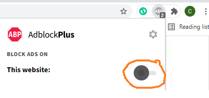
Đã phát hiện trình chặn quảng cáo AdBlock
Trang web này phụ thuộc vào doanh thu từ số lần hiển thị quảng cáo để tồn tại. Vui lòng tắt trình chặn quảng cáo của bạn hoặc tạm dừng tính năng chặn quảng cáo cho trang web này.