Kinh doanh - Marketing
Kinh tế quản lý
Biểu mẫu - Văn bản
Tài chính - Ngân hàng
Công nghệ thông tin
Tiếng anh ngoại ngữ
Kĩ thuật công nghệ
Khoa học tự nhiên
Khoa học xã hội
Văn hóa nghệ thuật
Sức khỏe - Y tế
Văn bản luật
Nông Lâm Ngư
Kỹ năng mềm
Luận văn - Báo cáo
Giải trí - Thư giãn
Tài liệu phổ thông
Văn mẫu
Tài liệu HOT
Tìm
Danh mục
Kinh doanh - Marketing
Kinh tế quản lý
Biểu mẫu - Văn bản
Tài chính - Ngân hàng
Công nghệ thông tin
Tiếng anh ngoại ngữ
Kĩ thuật công nghệ
Khoa học tự nhiên
Khoa học xã hội
Văn hóa nghệ thuật
Y tế sức khỏe
Văn bản luật
Nông lâm ngư
Kĩ năng mềm
Luận văn - Báo cáo
Giải trí - Thư giãn
Tài liệu phổ thông
Văn mẫu
Thông tin
Điều khoản sử dụng
Quy định bảo mật
Quy chế hoạt động
Chính sách bản quyền
0
Trang chủ
Công Nghệ Thông Tin
Đồ họa - Thiết kế - Flash
HTML cơ bản - p 16
TAILIEUCHUNG - HTML cơ bản - p 16
134 Chapter 3: Elements of Style Points and picas are traditional typographic measures. There are 12 points to a pica and 6 picas to an inch. Therefore, a font size of 18 points is equivalent to picas, or .25 inches. Ems and exes are also typographic measures. Like a percentage value, they specify sizes relative to the element’s computed size rather than an absolute number of units. When type was set using individual letters cast in lead alloy, font sets included spacer characters of different sizes. An em-quad was a square space just large enough to contain an uppercase M. Exes. | 134 Chapter 3 Elements of StyLE Points and picas are traditional typographic measures. There are 12 points to a pica and 6 picas to an inch. Therefore a font size of 18 points is equivalent to picas or .25 inches. Ems and exes are also typographic measures. Like a percentage value they specify sizes relative to the element s computed size rather than an absolute number of units. When type was set using individual letters cast in lead alloy font sets included spacer characters of different sizes. An em-quad was a square space just large enough to contain an uppercase M. Exes are squares the size of a lowercase x. Obviously a larger font will have larger ems and exes in absolute terms. However in CSS one em is equivalent to 100 percent of the current font size. To illustrate consider the following three CSS statements main main main font-size medium font-size 1em font-size 100 In a division element with id main the two nested paragraphs with classes first and second will have the same font size measured in pixels if they are in the same font family. If the two paragraphs are of different font families they may appear to have different font sizes. An em measure is only a guideline for font designers who are free to make their letters larger or smaller as they please. Here are some examples blockquote font-size 18pt font-size 16px intro font-size 7mm address font-size Font sizes given in pixels are relative to the browser s viewport and therefore are dependent on the resolution of the reader s display device and the viewer s distance from the display. Pixels are not simple screen dots anymore. However as a rough guide a 17-inch monitor measured diagonally set to a resolution of 1024 by 768 pixels is very close to 72 pixels per inch. Because this is now considered the low end of display screen technology most PC users are looking at a screen with approximately 96 pixels per inch. Mobile and tablet users may have resolutions and .
Cát Tiên
121
10
pdf
Báo lỗi
Trùng lắp nội dung
Văn hóa đồi trụy
Phản động
Bản quyền
File lỗi
Khác
Upload
Tải xuống
đang nạp các trang xem trước
Bấm vào đây để xem trước nội dung
Tải xuống
TÀI LIỆU LIÊN QUAN
Bài giảng Lập trình web toàn tập với HTML, CSS, Jquery, Responsive, Bootstrap - Chương 4: HTML căn bản và bài tập
67
147
7
DANH MỤC TAG HTML CƠ BẢN
5
102
1
Bài giảng Ngôn ngữ HTML - Đỗ Hiệp Thuận
29
106
4
Cơ bản về HTML, JAVASCRIPT, CSS và ASP
87
75
0
Bài giảng Lập trình web - Chương 1: Ngôn ngữ HTML
29
106
1
Bài 3: HTML cơ bản
97
83
0
Cơ bản html p1
5
63
0
Bài giảng Nhập môn HTML và thiết kế Web: Bài 2 - Các thẻ HTML cơ bản
1
101
1
HTML toàn tập
88
80
1
Cơ bản html p2
5
58
0
TÀI LIỆU XEM NHIỀU
Một Case Về Hematology (1)
8
462343
61
Giới thiệu :Lập trình mã nguồn mở
14
26232
79
Tiểu luận: Tư tưởng Hồ Chí Minh về xây dựng nhà nước trong sạch vững mạnh
13
11352
542
Câu hỏi và đáp án bài tập tình huống Quản trị học
14
10553
466
Phân tích và làm rõ ý kiến sau: “Bài thơ Tự tình II vừa nói lên bi kịch duyên phận vừa cho thấy khát vọng sống, khát vọng hạnh phúc của Hồ Xuân Hương”
3
9844
108
Ebook Facts and Figures – Basic reading practice: Phần 1 – Đặng Tuấn Anh (Dịch)
249
8892
1161
Tiểu luận: Nội dung tư tưởng Hồ Chí Minh về đạo đức
16
8508
426
Mẫu đơn thông tin ứng viên ngân hàng VIB
8
8101
2279
Giáo trình Tư tưởng Hồ Chí Minh - Mạch Quang Thắng (Dành cho bậc ĐH - Không chuyên ngành Lý luận chính trị)
152
7786
1798
Đề tài: Dự án kinh doanh thời trang quần áo nữ
17
7279
268
TỪ KHÓA LIÊN QUAN
Đồ họa - Thiết kế - Flash
html cơ bản
html
ngôn ngữ html
thủ thuật htlm
thiết kế web
Lập trình web toàn tập với HTML
HTML căn bản
Bài tập HTML căn bản
Khái niệm HTML
Cấu trúc của HTML
Các tag cơ bản
tag HTML
tài liệu về html
cơ bản về html
lập trình html
Bài giảng Ngôn ngữ HTML
Thành phần của HTML
Ngôn ngữ lập trình
Thẻ HTML nâng cao
Thẻ HTML cơ bản
JAVASCRIPT
CSS và ASP
phần tử HTML cơ bản
bài tập cơ bản về HTML
lập trình ứng dụng
Lập trình web
Bài giảng Lập trình web
Tin học cơ sở
Bài giảng tin học văn phòng
Tin học căn bản
Bài giảng tin học
Bài giảng Nhập môn HTML
Các thẻ HTML cơ bản
Thẻ siêu liên kết
Thẻ mức đoạn
Thẻ định dạng ký tự
HTML toàn tập
Lập trình Web bằng HTML
Thành phần Element
Thuộc tính Attribues
Giá trị Values
Viết Codes vào NotePad
Mô tả HTML
html co7 bản
TÀI LIỆU MỚI ĐĂNG
Giáo án mầm non chương trình đổi mới: Gia đình vui nhộn
4
392
3
31-12-2024
Báo cáo nghiên cứu khoa học " KẾT QUẢ NGHIÊN CỨU BƯỚC ĐẦU VỀ THIÊN ĐỊCH CHÂN KHỚP TRÊN CÂY THANH TRÀ Ở THỪA THIÊN HUẾ "
7
279
4
31-12-2024
báo cáo hóa học:" Increased androgen receptor expression in serous carcinoma of the ovary is associated with an improved survival"
6
156
3
31-12-2024
Báo cáo nghiên cứu nông nghiệp " Field control of pest fruit flies in Vietnam "
14
192
4
31-12-2024
Hướng dẫn chế độ dinh dưỡng cho người bệnh viêm khớp
5
171
2
31-12-2024
Báo cáo " Thẩm quyền quản lí nhà nước đối với hoạt động quảng cáo thực trạng và hướng hoàn thiện "
7
207
7
31-12-2024
Báo cáo " Bàn về hành vi pháp luật và hành vi đạo đức "
11
180
2
31-12-2024
Bệnh sán lá gan trên gia súc và cách phòng trị
3
164
1
31-12-2024
Báo cáo nghiên cứu khoa học " NÂNG QUAN HỆ KINH TẾ THƯƠNG MẠI VIỆT NAM - TRUNG QUỐC LÊN TẦM CAO THỜI ĐẠI "
8
174
1
31-12-2024
Data Mining Classification: Basic Concepts, Decision Trees, and Model Evaluation Lecture Notes for Chapter 4 Introduction to Data Mining
101
142
1
31-12-2024
TÀI LIỆU HOT
Mẫu đơn thông tin ứng viên ngân hàng VIB
8
8101
2279
Giáo trình Tư tưởng Hồ Chí Minh - Mạch Quang Thắng (Dành cho bậc ĐH - Không chuyên ngành Lý luận chính trị)
152
7786
1798
Ebook Chào con ba mẹ đã sẵn sàng
112
4412
1374
Ebook Tuyển tập đề bài và bài văn nghị luận xã hội: Phần 1
62
6322
1274
Ebook Facts and Figures – Basic reading practice: Phần 1 – Đặng Tuấn Anh (Dịch)
249
8892
1161
Giáo trình Văn hóa kinh doanh - PGS.TS. Dương Thị Liễu
561
3846
680
Giáo trình Sinh lí học trẻ em: Phần 1 - TS Lê Thanh Vân
122
3921
609
Giáo trình Pháp luật đại cương: Phần 1 - NXB ĐH Sư Phạm
274
4724
566
Tiểu luận: Tư tưởng Hồ Chí Minh về xây dựng nhà nước trong sạch vững mạnh
13
11352
542
Bài tập nhóm quản lý dự án: Dự án xây dựng quán cafe
35
4511
490
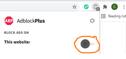
Đã phát hiện trình chặn quảng cáo AdBlock
Trang web này phụ thuộc vào doanh thu từ số lần hiển thị quảng cáo để tồn tại. Vui lòng tắt trình chặn quảng cáo của bạn hoặc tạm dừng tính năng chặn quảng cáo cho trang web này.