Kinh doanh - Marketing
Kinh tế quản lý
Biểu mẫu - Văn bản
Tài chính - Ngân hàng
Công nghệ thông tin
Tiếng anh ngoại ngữ
Kĩ thuật công nghệ
Khoa học tự nhiên
Khoa học xã hội
Văn hóa nghệ thuật
Sức khỏe - Y tế
Văn bản luật
Nông Lâm Ngư
Kỹ năng mềm
Luận văn - Báo cáo
Giải trí - Thư giãn
Tài liệu phổ thông
Văn mẫu
Tài liệu HOT
Tìm
Danh mục
Kinh doanh - Marketing
Kinh tế quản lý
Biểu mẫu - Văn bản
Tài chính - Ngân hàng
Công nghệ thông tin
Tiếng anh ngoại ngữ
Kĩ thuật công nghệ
Khoa học tự nhiên
Khoa học xã hội
Văn hóa nghệ thuật
Y tế sức khỏe
Văn bản luật
Nông lâm ngư
Kĩ năng mềm
Luận văn - Báo cáo
Giải trí - Thư giãn
Tài liệu phổ thông
Văn mẫu
Thông tin
Điều khoản sử dụng
Quy định bảo mật
Quy chế hoạt động
Chính sách bản quyền
0
Trang chủ
Công Nghệ Thông Tin
Đồ họa - Thiết kế - Flash
The Non-Designer's Design Book- P7
TAILIEUCHUNG - The Non-Designer's Design Book- P7
The Non-Designer's Design Book- P7: So you have a great concept and all the fancy digital tools you could possibly require—what's stopping you from creating beautiful pages? Namely the training to pull all of these elements together into a cohesive design that effectively communicates your message. Not to worry: This book is the one place you can turn to find quick, non-intimidating, excellent design help. In The Non-Designer's Design Book, 2nd Edition, best-selling author Robin Williams turns her attention to the basic principles of good design and typography. All you have to do is follow her clearly explained concepts, and you'll. | B Part 3 Extras Answers Quiz 1 page s4 Remove the border to open up space. New designers tend to put borders around everything. Stop it Let it breathe. Don t contain it so tightly Proximity The headings are too far away from their related items move them closer. There are double Returns above and below the headings take out all double Returns but add a little extra space above the headings so they are more closely connected to the following material they belong with. Separate personal info from resume items with a little extra space. Alignment Text is centered and flush left and second lines of text return all the way to the left edge create a strong flush left alignment all heads align with each other all bullets align all text aligns second lines of text align with first lines. Repetition There is already a repetition of the hyphen strengthen that repetition by making it a more interesting bullet and using it in front of every appropriate item. There is already a repetition in the headings strengthen that repetition by making the headings strong and black. The strong black impression in the bullets now repeats and reinforces the strong black in the headings. Contrast There isn t any use a strong bold face for contrast of heads including Resume to be consistent or repetitive add contrast with the strong bullets. By the way all the numbers in the new version are a point size smaller so they don t call undue attention to themselves. Answers Quiz 2 page 85 Different typefaces There are four different sans serifs Helvetica Avant Garde Optima and Formata Bold . There are two serif faces Aachen Bold and New Century Schoolbook . Choose two of those one nice strong bold such as the Aachen Bold and one sans serif. Different alignments Oh my gawd. Some elements are flush left some are centered some are centered in the middle of empty space some have no connection or alignment with anything else in the world. Strong line The .
Thiên Nương
54
14
pdf
Báo lỗi
Trùng lắp nội dung
Văn hóa đồi trụy
Phản động
Bản quyền
File lỗi
Khác
Upload
Tải xuống
đang nạp các trang xem trước
Bấm vào đây để xem trước nội dung
Tải xuống
TÀI LIỆU LIÊN QUAN
Bài giảng Thiết kế đa truyền thông với Adobe Flash CS6: Học phần H
35
93
4
Thiết kế flash với flash cs5 part 1
10
76
0
Thiết kế flash với flash cs5 part 2
10
69
0
Thiết kế flash với flash cs5 part 22
6
74
0
Thiết kế flash với flash cs5 part 23
15
80
0
Thiết kế flash với flash cs5 part 24
5
82
1
Thiết kế flash với flash cs5 part 25
6
89
0
Thiết kế flash với flash cs5 part 26
6
70
0
Thiết kế flash với flash cs5 part 27
6
69
0
Thiết kế flash với flash cs5 part 28
7
69
0
TÀI LIỆU XEM NHIỀU
Một Case Về Hematology (1)
8
462340
61
Giới thiệu :Lập trình mã nguồn mở
14
26020
79
Tiểu luận: Tư tưởng Hồ Chí Minh về xây dựng nhà nước trong sạch vững mạnh
13
11345
542
Câu hỏi và đáp án bài tập tình huống Quản trị học
14
10550
466
Phân tích và làm rõ ý kiến sau: “Bài thơ Tự tình II vừa nói lên bi kịch duyên phận vừa cho thấy khát vọng sống, khát vọng hạnh phúc của Hồ Xuân Hương”
3
9841
108
Ebook Facts and Figures – Basic reading practice: Phần 1 – Đặng Tuấn Anh (Dịch)
249
8889
1161
Tiểu luận: Nội dung tư tưởng Hồ Chí Minh về đạo đức
16
8504
426
Mẫu đơn thông tin ứng viên ngân hàng VIB
8
8100
2279
Giáo trình Tư tưởng Hồ Chí Minh - Mạch Quang Thắng (Dành cho bậc ĐH - Không chuyên ngành Lý luận chính trị)
152
7735
1790
Đề tài: Dự án kinh doanh thời trang quần áo nữ
17
7263
268
TỪ KHÓA LIÊN QUAN
Đồ họa - Thiết kế - Flash
thiết kế flash
giáo trình photoshop cơ bản
thiết kế web
CSS cơ bản
đồ họa máy tính
kỹ thuật cắt html
Thiết kế đa truyền thông với Adobe Flash CS6
Adobe Flash CS6
Chỉnh sửa ảnh Photoshop từ Flash
Chèn đoạn phim Flash vào Dreamweaver
Chỉnh sửa đoạn phim Flash từ Dreamweaver
Nhập file AI từ Illustrator vào Flash
Tích hợp nội dung Flash
flash cs5
thủ thuật flash cs5
tài liệu flash cs5
học flash cs5
ebook flash cs5
TÀI LIỆU MỚI ĐĂNG
Báo cáo nghiên cứu khoa học " KẾT QUẢ NGHIÊN CỨU BƯỚC ĐẦU VỀ THIÊN ĐỊCH CHÂN KHỚP TRÊN CÂY THANH TRÀ Ở THỪA THIÊN HUẾ "
7
276
4
26-12-2024
báo cáo hóa học:" Increased androgen receptor expression in serous carcinoma of the ovary is associated with an improved survival"
6
156
3
26-12-2024
Quy Trình Canh Tác Cây Bông Vải
8
164
3
26-12-2024
BÀI GIẢNG Biến Đổi Năng Lượng Điện Cơ - TS. Hồ Phạm Huy
137
158
1
26-12-2024
Word Games with English 1
65
137
1
26-12-2024
Báo cáo nghiên cứu khoa học " Sự nhất quán phát triển kinh tế thị trường XHCN trong xây dựng xã hội hài hoà của Trung Quốc và đổi mới của Việt Nam "
8
144
1
26-12-2024
OPEN SOURCE ERP REASONABLE TOOLS FOR MANUFACTURING SMEs?
1
148
1
26-12-2024
Lập trình Java cơ bản : Luồng và xử lý file part 8
5
140
1
26-12-2024
Báo cáo lâm nghiệp: "Assessment of the effects of below-zero temperatures on photosynthesis and chlorophyll a fluorescence in leaf discs of Eucalyptus globulu"
4
140
0
26-12-2024
CÂU HỎI TRẮC NGHIỆM HSLS NƯỚC TIỂU
9
175
0
26-12-2024
TÀI LIỆU HOT
Mẫu đơn thông tin ứng viên ngân hàng VIB
8
8100
2279
Giáo trình Tư tưởng Hồ Chí Minh - Mạch Quang Thắng (Dành cho bậc ĐH - Không chuyên ngành Lý luận chính trị)
152
7735
1790
Ebook Chào con ba mẹ đã sẵn sàng
112
4406
1371
Ebook Tuyển tập đề bài và bài văn nghị luận xã hội: Phần 1
62
6283
1266
Ebook Facts and Figures – Basic reading practice: Phần 1 – Đặng Tuấn Anh (Dịch)
249
8889
1161
Giáo trình Văn hóa kinh doanh - PGS.TS. Dương Thị Liễu
561
3839
680
Giáo trình Sinh lí học trẻ em: Phần 1 - TS Lê Thanh Vân
122
3919
609
Giáo trình Pháp luật đại cương: Phần 1 - NXB ĐH Sư Phạm
274
4708
565
Tiểu luận: Tư tưởng Hồ Chí Minh về xây dựng nhà nước trong sạch vững mạnh
13
11345
542
Bài tập nhóm quản lý dự án: Dự án xây dựng quán cafe
35
4508
490
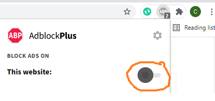
Đã phát hiện trình chặn quảng cáo AdBlock
Trang web này phụ thuộc vào doanh thu từ số lần hiển thị quảng cáo để tồn tại. Vui lòng tắt trình chặn quảng cáo của bạn hoặc tạm dừng tính năng chặn quảng cáo cho trang web này.