Kinh doanh - Marketing
Kinh tế quản lý
Biểu mẫu - Văn bản
Tài chính - Ngân hàng
Công nghệ thông tin
Tiếng anh ngoại ngữ
Kĩ thuật công nghệ
Khoa học tự nhiên
Khoa học xã hội
Văn hóa nghệ thuật
Sức khỏe - Y tế
Văn bản luật
Nông Lâm Ngư
Kỹ năng mềm
Luận văn - Báo cáo
Giải trí - Thư giãn
Tài liệu phổ thông
Văn mẫu
Tài liệu HOT
Tìm
Danh mục
Kinh doanh - Marketing
Kinh tế quản lý
Biểu mẫu - Văn bản
Tài chính - Ngân hàng
Công nghệ thông tin
Tiếng anh ngoại ngữ
Kĩ thuật công nghệ
Khoa học tự nhiên
Khoa học xã hội
Văn hóa nghệ thuật
Y tế sức khỏe
Văn bản luật
Nông lâm ngư
Kĩ năng mềm
Luận văn - Báo cáo
Giải trí - Thư giãn
Tài liệu phổ thông
Văn mẫu
Thông tin
Điều khoản sử dụng
Quy định bảo mật
Quy chế hoạt động
Chính sách bản quyền
0
Trang chủ
Công Nghệ Thông Tin
Kỹ thuật lập trình
Beginning JavaScript Third Edition phần 8
TAILIEUCHUNG - Beginning JavaScript Third Edition phần 8
Trường hợp JavaScript tuyên bố tiếp theo xảy ra trong trang của bạn phụ thuộc vào mã của bạn. Nếu bạn có mã trong trang khác hơn là một chức năng hoặc mã kết nối với một sự kiện Nếu trình duyệt Firefox, bạn sử dụng một vòng lặp để đi qua mảng bổ sung đối tượng hoa | Chapter 13 Dynamic HTML in Modern Browsers width 24px border 1px solid 316AC5 background-color C1D2EE padding 2px cursor pointer You ve already seen the first three properties they were used in the toolbar-button class. Next a blue border one pixel in width is added to the element and the background color is changed to a light blue. The padding is decreased to two pixels. You do this because padding and borders add extra height and width to the HTML element. Take a look at Figure 13-15 which illustrates this concept. Padding div Both elements 30 pixels in height and width Figure 13-15 This is a side-by-side comparison of the toolbar-button and toolbar-button-hover classes. The toolbar-button class is 24 pixels in height and width plus three pixels of padding per side. That makes toolbar-button 30 pixels in height and width. The toolbar-button-hover class starts with the same 24 pixels in height and width. You then add a one-pixel border which adds two pixels to the height and width. Then you add two pixels of padding on each side which makes toolbar-button-hover 30 pixels in height and width just like toolbarbutton. If you used three pixels of padding instead of two in toolbar-button-hover the button would grow in size when the mouse pointer hovered over it as Figure 13-16 shows. 530 Chapter 13 Dynamic HTML in Modern Browsers Padding Border Padding div 30px Figure 13-16 32px Let s take a second and look at these two rules. Notice that each has three properties with the same values display height and width . You can take these properties out and write a new rule for all span elements inside the toolbar. .toolbar span display inline-block height 24px width 24px You can now slim down the toolbar-button and toolbar-button-hover classes .toolbar-button padding 3px .toolbar-button-hover border 1px solid 316AC5 background-color C1D2EE padding 2px cursor pointer By making this change you can easily add style that is shared by both states. The last property we ll discuss .
Huy Khiêm
59
79
pdf
Báo lỗi
Trùng lắp nội dung
Văn hóa đồi trụy
Phản động
Bản quyền
File lỗi
Khác
Upload
Tải xuống
đang nạp các trang xem trước
Không thể tạo bản xem trước, hãy bấm tải xuống
Tải xuống
TÀI LIỆU LIÊN QUAN
Bài giảng Đồ họa máy tính - Ma Thị Châu
22
180
1
Bài giảng Tổng quan đồ họa máy tính
11
176
0
GIÁO TRÌNH ĐỒ HỌA MÁY TÍNH_TỔNG QUAN VỀ ĐỒ HỌA MÁY TÍNH
14
218
1
Đồ họa máy tính : GIỚI THIỆU VỀ ĐỒ HỌA MÁY TÍNH part 1
5
166
1
Đồ họa máy tính : GIỚI THIỆU VỀ ĐỒ HỌA MÁY TÍNH part 2
5
152
0
Đồ họa máy tính : GIỚI THIỆU VỀ ĐỒ HỌA MÁY TÍNH part 3
5
141
0
GIÁO TRÌNH ĐỒ HỌA MÁY TÍNH_ĐỒ HỌA 3 CHIỀU
8
232
1
GIÁO TRÌNH ĐỒ HỌA MÁY TÍNH_CÁC ĐỐI TƯỢNG ĐỒ HỌA CƠ SỞ
6
259
0
GIÁO TRÌNH ĐỒ HỌA MÁY TÍNH_CÁC PHÉP BIẾN ĐỔI TRONG ĐỒ HỌA HAI CHIỀU
16
252
2
Đồ họa máy tính : CÁC ĐỐI TƯỢNG ĐỒ HỌA CƠ SỞ part 1
5
154
0
TÀI LIỆU XEM NHIỀU
Một Case Về Hematology (1)
8
462348
61
Giới thiệu :Lập trình mã nguồn mở
14
26531
79
Tiểu luận: Tư tưởng Hồ Chí Minh về xây dựng nhà nước trong sạch vững mạnh
13
11372
543
Câu hỏi và đáp án bài tập tình huống Quản trị học
14
10560
468
Phân tích và làm rõ ý kiến sau: “Bài thơ Tự tình II vừa nói lên bi kịch duyên phận vừa cho thấy khát vọng sống, khát vọng hạnh phúc của Hồ Xuân Hương”
3
9852
108
Ebook Facts and Figures – Basic reading practice: Phần 1 – Đặng Tuấn Anh (Dịch)
249
8897
1161
Tiểu luận: Nội dung tư tưởng Hồ Chí Minh về đạo đức
16
8512
426
Mẫu đơn thông tin ứng viên ngân hàng VIB
8
8107
2279
Giáo trình Tư tưởng Hồ Chí Minh - Mạch Quang Thắng (Dành cho bậc ĐH - Không chuyên ngành Lý luận chính trị)
152
7861
1807
Đề tài: Dự án kinh doanh thời trang quần áo nữ
17
7285
268
TỪ KHÓA LIÊN QUAN
Kỹ thuật lập trình
đồ họa máy tính
mỹ thuật đa truyền thông
học hệ điều hành
tìm hiểu hệ điều hành
cách sử dụng hệ điều hành
hệ điều hành windows 7
mẹo hay hệ điều hành
thủ thuật hệ điều hành
Bài giảng Đồ họa máy tính
Khái niệm Đồ họa máy tính
Ứng dụng Đồ họa máy tính
Công nghệ Đồ họa máy tính
Tài liệu Đồ họa máy tính
Tổng quan đồ họa máy tính
Bài giảng Tổng quan đồ họa máy tính
Lịch sử đồ họa máy tính
Ứng dụng của đồ họa máy tính
Đồ họa máy tính trong điện ảnh
Đồ họa máy tính trong trò chơi
thiết kế đồ họa
giới thiệu Đồ họa máy tính
lý thuyết Đồ họa máy tính
Giáo trình Đồ họa máy tính
Tìm hiểu đồ họa máy tính
Đồ họa hai chiều
Đồ họa ba chiều
Tổng quan về một hệ đồ họa
Hệ đồ họa
lập trình đồ họa máy tính
Thuật toán đồ họa máy tính
Thuật toán cơ sở
Câu hỏi Đồ Họa Máy Tính
Các ứng dụng đồ họa máy tính
Kiến thức đồ họa
Đồ họa điểm
Đồ họa Vector
Cơ sở đồ họa máy tính
Bài giảng Cơ sở đồ họa máy tính
Đồ họa 2 chiều
Hệ thống giao tiếp bằng đồ họa
Lý thuyết đồ họa 3D
TÀI LIỆU MỚI ĐĂNG
Data Structures and Algorithms - Chapter 8: Heaps
41
192
5
05-01-2025
Báo cáo nghiên cứu nông nghiệp " Field control of pest fruit flies in Vietnam "
14
195
4
05-01-2025
BÀI GIẢNG Biến Đổi Năng Lượng Điện Cơ - TS. Hồ Phạm Huy
137
165
1
05-01-2025
báo cáo hóa học:" Quality of data collection in a large HIV observational clinic database in sub-Saharan Africa: implications for clinical research and audit of care"
7
159
4
05-01-2025
CHƯƠNG 2: RỦI RO THÂM HỤT TÀI KHÓA
28
165
1
05-01-2025
Báo cáo y học: "The Factors Influencing Depression Endpoints Research (FINDER) study: final results of Italian patients with depressio"
9
154
1
05-01-2025
Báo cáo nghiên cứu khoa học " NÂNG QUAN HỆ KINH TẾ THƯƠNG MẠI VIỆT NAM - TRUNG QUỐC LÊN TẦM CAO THỜI ĐẠI "
8
177
1
05-01-2025
OPEN SOURCE ERP REASONABLE TOOLS FOR MANUFACTURING SMEs?
1
153
1
05-01-2025
Sáng kiến kinh nghiệm môn mỹ thuật
5
181
1
05-01-2025
Lịch sử Trung Quốc 5000 năm tập 3 part 2
54
156
1
05-01-2025
TÀI LIỆU HOT
Mẫu đơn thông tin ứng viên ngân hàng VIB
8
8107
2279
Giáo trình Tư tưởng Hồ Chí Minh - Mạch Quang Thắng (Dành cho bậc ĐH - Không chuyên ngành Lý luận chính trị)
152
7861
1807
Ebook Chào con ba mẹ đã sẵn sàng
112
4429
1376
Ebook Tuyển tập đề bài và bài văn nghị luận xã hội: Phần 1
62
6336
1275
Ebook Facts and Figures – Basic reading practice: Phần 1 – Đặng Tuấn Anh (Dịch)
249
8897
1161
Giáo trình Văn hóa kinh doanh - PGS.TS. Dương Thị Liễu
561
3856
680
Giáo trình Sinh lí học trẻ em: Phần 1 - TS Lê Thanh Vân
122
3927
610
Giáo trình Pháp luật đại cương: Phần 1 - NXB ĐH Sư Phạm
274
4758
567
Tiểu luận: Tư tưởng Hồ Chí Minh về xây dựng nhà nước trong sạch vững mạnh
13
11372
543
Bài tập nhóm quản lý dự án: Dự án xây dựng quán cafe
35
4530
490
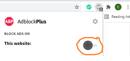
Đã phát hiện trình chặn quảng cáo AdBlock
Trang web này phụ thuộc vào doanh thu từ số lần hiển thị quảng cáo để tồn tại. Vui lòng tắt trình chặn quảng cáo của bạn hoặc tạm dừng tính năng chặn quảng cáo cho trang web này.