Kinh doanh - Marketing
Kinh tế quản lý
Biểu mẫu - Văn bản
Tài chính - Ngân hàng
Công nghệ thông tin
Tiếng anh ngoại ngữ
Kĩ thuật công nghệ
Khoa học tự nhiên
Khoa học xã hội
Văn hóa nghệ thuật
Sức khỏe - Y tế
Văn bản luật
Nông Lâm Ngư
Kỹ năng mềm
Luận văn - Báo cáo
Giải trí - Thư giãn
Tài liệu phổ thông
Văn mẫu
Tài liệu HOT
Tìm
Danh mục
Kinh doanh - Marketing
Kinh tế quản lý
Biểu mẫu - Văn bản
Tài chính - Ngân hàng
Công nghệ thông tin
Tiếng anh ngoại ngữ
Kĩ thuật công nghệ
Khoa học tự nhiên
Khoa học xã hội
Văn hóa nghệ thuật
Y tế sức khỏe
Văn bản luật
Nông lâm ngư
Kĩ năng mềm
Luận văn - Báo cáo
Giải trí - Thư giãn
Tài liệu phổ thông
Văn mẫu
Thông tin
Điều khoản sử dụng
Quy định bảo mật
Quy chế hoạt động
Chính sách bản quyền
0
Trang chủ
Công Nghệ Thông Tin
Hệ điều hành
Wiley Office 2007 Bible phần 6
TAILIEUCHUNG - Wiley Office 2007 Bible phần 6
Đối với lệnh Paste Special sẽ có sẵn, bạn cần phải sao chép một tế bào hoặc phạm vi. (Chọn Trang chủ ➪ Clipboard ➪ Cut không làm việc.)Bảng tính thiết yếu và các hoạt động Phạm vi di độngTất cả: Dán nội dung, định dạng của tế bào, và xác nhận dữ liệu | Working with Tables and Charts 23 Starting a New Chart The main difficulty with creating a chart in a non-spreadsheet application such as PowerPoint is that there is no data table from which to pull the numbers. Therefore PowerPoint creates charts using data that you have entered in an Excel window. By default it contains sample data which you can replace with your own data. You can place a new chart on a slide in two ways you can either use a chart placeholder from a layout or you can place one manually. If you are using a placeholder click the Insert Chart icon. If you are placing a chart manually follow these steps 1. On the Insert tab click Chart. The Insert Chart dialog box opens as shown in Figure 23-28. FIGURE 23-28 Select the desired chart type. 2. Click the desired chart type. See Table 23-2 for an explanation of the chart types. Figures 23-29 and 23-30 show examples of some of the chart types. 3. Click OK. The chart appears on the slide and an Excel datasheet opens with sample data. 577 Part IV Persuading and Informing with PowerPoint 4. Modify the sample data as needed. To change the range of cells that appear in the chart see the section Redefining the data range later in this chapter. If you want you can then close the Excel window to move it out of the way 77 After you have closed the Excel window you can open it again by clicking Edit Data on the HmeKm mU U Chart Tools Design tab. FIGURE 23-29 Examples of chart types from top left clockwise column line bar and pie. 578 Working with Tables and Charts 23 FIGURE 23-30 Examples of chart types from top left clockwise area scatter doughnut and surface. On North South East TABLE 23-2 Chart Types in PowerPoint 2007 s Charting Tool Type Description Column Vertical bars optionally with multiple data series. Bars can be clustered stacked or based on a percentage and either 2-D or 3-D. Line Shows values as points and connects the points with a line. Different series use different colors and or line styles. Pie A
Chí Anh
32
124
pdf
Báo lỗi
Trùng lắp nội dung
Văn hóa đồi trụy
Phản động
Bản quyền
File lỗi
Khác
Upload
Tải xuống
đang nạp các trang xem trước
Không thể tạo bản xem trước, hãy bấm tải xuống
Tải xuống
TÀI LIỆU LIÊN QUAN
Bài giảng môn Hệ Điều Hành
26
542
15
Building XP Live CD - Hướng dẫn tạo Windows XP chạy trên CD
12
159
0
Deploying and Administering Windows Vista Bible
575
163
0
Những tính năng hữu ích trong windows 7 (Tiếng Việt)
117
171
2
Windows 7 Toàn tập
41
306
15
7 việc cần làm để “refresh” hệ điều hành Android cũ
13
168
0
Creative Suite 5 Motion Graphics with Adobe phần 1
48
153
0
Creative Suite 5 Motion Graphics with Adobe phần 2
46
150
0
Creative Suite 5 Motion Graphics with Adobe phần 3
46
156
0
Creative Suite 5 Motion Graphics with Adobe phần 4
46
152
0
TÀI LIỆU XEM NHIỀU
Một Case Về Hematology (1)
8
461991
55
Giới thiệu :Lập trình mã nguồn mở
14
23347
68
Tiểu luận: Tư tưởng Hồ Chí Minh về xây dựng nhà nước trong sạch vững mạnh
13
11034
533
Câu hỏi và đáp án bài tập tình huống Quản trị học
14
10247
453
Phân tích và làm rõ ý kiến sau: “Bài thơ Tự tình II vừa nói lên bi kịch duyên phận vừa cho thấy khát vọng sống, khát vọng hạnh phúc của Hồ Xuân Hương”
3
9593
106
Ebook Facts and Figures – Basic reading practice: Phần 1 – Đặng Tuấn Anh (Dịch)
249
8466
1139
Tiểu luận: Nội dung tư tưởng Hồ Chí Minh về đạo đức
16
8313
423
Mẫu đơn thông tin ứng viên ngân hàng VIB
8
7904
2239
Đề tài: Dự án kinh doanh thời trang quần áo nữ
17
6892
257
Giáo trình Tư tưởng Hồ Chí Minh - Mạch Quang Thắng (Dành cho bậc ĐH - Không chuyên ngành Lý luận chính trị)
152
6328
1532
TỪ KHÓA LIÊN QUAN
Hệ điều hành
thủ thuật hệ điều hành
tìm hiểu hệ điều hành
thủ thuật windows
lập trình windows
lập trình ứng dụng
lập trình máy tính
thủ thuật lập trình
mẹo hay cho lập trình
bí quyết lập trình
thủ thuật máy tính
phần mềm máy tính
quản trị hệ thống
hệ điều hành linux
hệ điều hành mac
mẹo cài hệ điều hành
hệ điều hành unix
hệ điều hành windows
kỹ năng máy tính
Hệ Điều Hành
các hệ điều hành Windows
giáo trình hệ điều hành
các vấn đề hệ điều hành
tài liệu hệ điều hành
Tổng quan về hệ điều hành
windows 7
Refresh hệ điều hành Android
Hệ điều hành Android cũ
Hệ điều hành Android
Cài đặt hệ điều hành Android
Thủ thuật hệ điều hành Android
Khôi phục hệ điều hành Android
đồ họa máy tính
mỹ thuật đa truyền thông
học hệ điều hành
cách sử dụng hệ điều hành
hệ điều hành windows 7
mẹo hay hệ điều hành
TÀI LIỆU MỚI ĐĂNG
Sáng tạo trong thuật toán và lập trình với ngôn ngữ Pascal và C# Tập 2 - Chương 4
47
270
1
03-06-2024
Anh văn bằng C-124
8
199
0
03-06-2024
Công nghiệp gang thép Việt Nam : Một giai đoạn phát triển và chuyển đổi chính sách mới part 5
6
209
0
03-06-2024
THE ANTHROPOLOGY OF ONLINE COMMUNITIES BY Samuel M.Wilson and Leighton C. Peterson
19
165
0
03-06-2024
báo cáo hóa học:" Endoscopic decompression for intraforaminal and extraforaminal nerve root compression"
7
122
0
03-06-2024
Bài Tiểu Luận Chuyên Đề Tổ Chức Hoạt Động Nhận Thức Trong Dạy Học Vật Lý " Định Luật Ôm Cho Các Loại Đoạn Mạch Chứa Nguồn Điện"
10
169
3
03-06-2024
báo cáo hóa học:" Increased androgen receptor expression in serous carcinoma of the ovary is associated with an improved survival"
6
114
0
03-06-2024
Điều bạn cần làm để giữ chặt tình yêu
5
119
0
03-06-2024
báo cáo hóa học:" Perceptions of rewards among volunteer caregivers of people living with AIDS working in faith-based organizations in South Africa: a qualitative study"
10
101
0
03-06-2024
Concluding interview 6
6
101
0
03-06-2024
TÀI LIỆU HOT
Mẫu đơn thông tin ứng viên ngân hàng VIB
8
7904
2239
Giáo trình Tư tưởng Hồ Chí Minh - Mạch Quang Thắng (Dành cho bậc ĐH - Không chuyên ngành Lý luận chính trị)
152
6328
1532
Ebook Chào con ba mẹ đã sẵn sàng
112
3896
1281
Ebook Tuyển tập đề bài và bài văn nghị luận xã hội: Phần 1
62
5511
1148
Ebook Facts and Figures – Basic reading practice: Phần 1 – Đặng Tuấn Anh (Dịch)
249
8466
1139
Giáo trình Văn hóa kinh doanh - PGS.TS. Dương Thị Liễu
561
3585
658
Giáo trình Sinh lí học trẻ em: Phần 1 - TS Lê Thanh Vân
122
3786
570
Tiểu luận: Tư tưởng Hồ Chí Minh về xây dựng nhà nước trong sạch vững mạnh
13
11034
533
Giáo trình Pháp luật đại cương: Phần 1 - NXB ĐH Sư Phạm
274
4229
527
Bài tập nhóm quản lý dự án: Dự án xây dựng quán cafe
35
4238
483
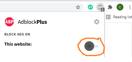
Đã phát hiện trình chặn quảng cáo AdBlock
Trang web này phụ thuộc vào doanh thu từ số lần hiển thị quảng cáo để tồn tại. Vui lòng tắt trình chặn quảng cáo của bạn hoặc tạm dừng tính năng chặn quảng cáo cho trang web này.