Kinh doanh - Marketing
Kinh tế quản lý
Biểu mẫu - Văn bản
Tài chính - Ngân hàng
Công nghệ thông tin
Tiếng anh ngoại ngữ
Kĩ thuật công nghệ
Khoa học tự nhiên
Khoa học xã hội
Văn hóa nghệ thuật
Sức khỏe - Y tế
Văn bản luật
Nông Lâm Ngư
Kỹ năng mềm
Luận văn - Báo cáo
Giải trí - Thư giãn
Tài liệu phổ thông
Văn mẫu
Tài liệu HOT
Tìm
Danh mục
Kinh doanh - Marketing
Kinh tế quản lý
Biểu mẫu - Văn bản
Tài chính - Ngân hàng
Công nghệ thông tin
Tiếng anh ngoại ngữ
Kĩ thuật công nghệ
Khoa học tự nhiên
Khoa học xã hội
Văn hóa nghệ thuật
Y tế sức khỏe
Văn bản luật
Nông lâm ngư
Kĩ năng mềm
Luận văn - Báo cáo
Giải trí - Thư giãn
Tài liệu phổ thông
Văn mẫu
Thông tin
Điều khoản sử dụng
Quy định bảo mật
Quy chế hoạt động
Chính sách bản quyền
0
Trang chủ
Công Nghệ Thông Tin
Đồ họa - Thiết kế - Flash
The Non-Designer's Design Book- P5
TAILIEUCHUNG - The Non-Designer's Design Book- P5
The Non-Designer's Design Book- P5: So you have a great concept and all the fancy digital tools you could possibly require—what's stopping you from creating beautiful pages? Namely the training to pull all of these elements together into a cohesive design that effectively communicates your message. Not to worry: This book is the one place you can turn to find quick, non-intimidating, excellent design help. In The Non-Designer's Design Book, 2nd Edition, best-selling author Robin Williams turns her attention to the basic principles of good design and typography. All you have to do is follow her clearly explained concepts, and you'll. | IQ Part 1 Design principles Tips on designing web pages_ Two of the most important factors in good web design are repetition and clarity. A visitor should never have to figure out how to use your navigation system where they are in the site or whether they are still in your web site or have jumped somewhere else. Repetition Repeat certain visual elements on every page in your web site. This not only lets the visitor know they are still at your site but also provides unity and continuity intrinsic features of any good design. Once you get to content pages the visitor should find the navigation in the same place in the same order with the same graphics. Not only does this make it easy for the visitor to find their way through your site but it provides a unifying factor to the collection of pages. Readability One of the most unreadable places to read text is on a monitor whether it s television video or computer. So we need to make a few adjustments to the text on web pages to make sure it s as easy to read as possible. Use shorter line lengths than you might use on paper. The body copy should never run the entire width of the web page which means you must put the text in a table or at least use a block indent which indents the text from both the left and right sides . But don t use such short line lengths that you break up the phrasing of the sentences too much. If you are specifying the text to appear in a certain typeface if you re not ignore this typically Helvetica or Arial and Times or Times Roman please specify Geneva in front of Helvetica and New York in front of Times. This will make the text on Macintoshes appear much so much cleaner and easier to read. If you use a Mac set your default font to New York instead of Times and you will be amazed at how much easier it is to read web pages. Change it back to Times before you print a page. Verdana is found on all operating systems updated within the past few years and it s an
Kiều Khanh
49
30
pdf
Báo lỗi
Trùng lắp nội dung
Văn hóa đồi trụy
Phản động
Bản quyền
File lỗi
Khác
Upload
Tải xuống
đang nạp các trang xem trước
Không thể tạo bản xem trước, hãy bấm tải xuống
Tải xuống
TÀI LIỆU LIÊN QUAN
Bài giảng Thiết kế đa truyền thông với Adobe Flash CS6: Học phần H
35
93
4
Thiết kế flash với flash cs5 part 1
10
76
0
Thiết kế flash với flash cs5 part 2
10
69
0
Thiết kế flash với flash cs5 part 22
6
74
0
Thiết kế flash với flash cs5 part 23
15
80
0
Thiết kế flash với flash cs5 part 24
5
82
1
Thiết kế flash với flash cs5 part 25
6
89
0
Thiết kế flash với flash cs5 part 26
6
70
0
Thiết kế flash với flash cs5 part 27
6
69
0
Thiết kế flash với flash cs5 part 28
7
69
0
TÀI LIỆU XEM NHIỀU
Một Case Về Hematology (1)
8
461847
55
Giới thiệu :Lập trình mã nguồn mở
14
22518
57
Tiểu luận: Tư tưởng Hồ Chí Minh về xây dựng nhà nước trong sạch vững mạnh
13
10865
529
Câu hỏi và đáp án bài tập tình huống Quản trị học
14
10029
445
Phân tích và làm rõ ý kiến sau: “Bài thơ Tự tình II vừa nói lên bi kịch duyên phận vừa cho thấy khát vọng sống, khát vọng hạnh phúc của Hồ Xuân Hương”
3
9490
104
Ebook Facts and Figures – Basic reading practice: Phần 1 – Đặng Tuấn Anh (Dịch)
249
8243
1124
Tiểu luận: Nội dung tư tưởng Hồ Chí Minh về đạo đức
16
8206
423
Mẫu đơn thông tin ứng viên ngân hàng VIB
8
7860
2220
Đề tài: Dự án kinh doanh thời trang quần áo nữ
17
6646
253
Vật lý hạt cơ bản (1)
29
5755
85
TỪ KHÓA LIÊN QUAN
Đồ họa - Thiết kế - Flash
thiết kế flash
giáo trình photoshop cơ bản
thiết kế web
CSS cơ bản
đồ họa máy tính
kỹ thuật cắt html
Thiết kế đa truyền thông với Adobe Flash CS6
Adobe Flash CS6
Chỉnh sửa ảnh Photoshop từ Flash
Chèn đoạn phim Flash vào Dreamweaver
Chỉnh sửa đoạn phim Flash từ Dreamweaver
Nhập file AI từ Illustrator vào Flash
Tích hợp nội dung Flash
flash cs5
thủ thuật flash cs5
tài liệu flash cs5
học flash cs5
ebook flash cs5
TÀI LIỆU MỚI ĐĂNG
Giáo án mầm non chương trình đổi mới: Gia đình vui nhộn
4
309
1
20-04-2024
Đánh giá hao mòn và độ tin cậy của chi tiết và kết cấu trên đầu máy diezel part 3
12
301
0
20-04-2024
BeginningMac OS X Tiger Dashboard Widget Development 2006 phần 2
34
205
0
20-04-2024
Trading Strategies Profit Making Techniques For Stock_3
23
181
0
20-04-2024
Bơm máy nén quạt trong công nghệ part 1
20
248
2
20-04-2024
Magnetic Bearings Theory and Applications phần 2
14
170
0
20-04-2024
THE ANTHROPOLOGY OF ONLINE COMMUNITIES BY Samuel M.Wilson and Leighton C. Peterson
19
138
0
20-04-2024
QUẢN LÝ CHẤT LƯỢNG KHÔNG KHÍ
75
136
0
20-04-2024
Bảng màu theo chữ cái – V
11
98
0
20-04-2024
GYNECOLOGIC CANCERS IN PREGNANCY: GUIDELINES OF AN INTERNATIONAL CONSENSUS MEETING
12
90
0
20-04-2024
TÀI LIỆU HOT
Mẫu đơn thông tin ứng viên ngân hàng VIB
8
7860
2220
Giáo trình Tư tưởng Hồ Chí Minh - Mạch Quang Thắng (Dành cho bậc ĐH - Không chuyên ngành Lý luận chính trị)
152
5601
1327
Ebook Chào con ba mẹ đã sẵn sàng
112
3752
1229
Ebook Facts and Figures – Basic reading practice: Phần 1 – Đặng Tuấn Anh (Dịch)
249
8243
1124
Ebook Tuyển tập đề bài và bài văn nghị luận xã hội: Phần 1
62
5255
1124
Giáo trình Văn hóa kinh doanh - PGS.TS. Dương Thị Liễu
561
3473
641
Tiểu luận: Tư tưởng Hồ Chí Minh về xây dựng nhà nước trong sạch vững mạnh
13
10865
529
Giáo trình Sinh lí học trẻ em: Phần 1 - TS Lê Thanh Vân
122
3670
524
Giáo trình Pháp luật đại cương: Phần 1 - NXB ĐH Sư Phạm
274
4024
513
Bài tập nhóm quản lý dự án: Dự án xây dựng quán cafe
35
4100
478
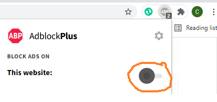
Đã phát hiện trình chặn quảng cáo AdBlock
Trang web này phụ thuộc vào doanh thu từ số lần hiển thị quảng cáo để tồn tại. Vui lòng tắt trình chặn quảng cáo của bạn hoặc tạm dừng tính năng chặn quảng cáo cho trang web này.