Kinh doanh - Marketing
Kinh tế quản lý
Biểu mẫu - Văn bản
Tài chính - Ngân hàng
Công nghệ thông tin
Tiếng anh ngoại ngữ
Kĩ thuật công nghệ
Khoa học tự nhiên
Khoa học xã hội
Văn hóa nghệ thuật
Sức khỏe - Y tế
Văn bản luật
Nông Lâm Ngư
Kỹ năng mềm
Luận văn - Báo cáo
Giải trí - Thư giãn
Tài liệu phổ thông
Văn mẫu
Tài liệu HOT
Tìm
Danh mục
Kinh doanh - Marketing
Kinh tế quản lý
Biểu mẫu - Văn bản
Tài chính - Ngân hàng
Công nghệ thông tin
Tiếng anh ngoại ngữ
Kĩ thuật công nghệ
Khoa học tự nhiên
Khoa học xã hội
Văn hóa nghệ thuật
Y tế sức khỏe
Văn bản luật
Nông lâm ngư
Kĩ năng mềm
Luận văn - Báo cáo
Giải trí - Thư giãn
Tài liệu phổ thông
Văn mẫu
Thông tin
Điều khoản sử dụng
Quy định bảo mật
Quy chế hoạt động
Chính sách bản quyền
0
Trang chủ
Công Nghệ Thông Tin
Đồ họa - Thiết kế - Flash
CSS Mastery- P6
TAILIEUCHUNG - CSS Mastery- P6
CSS Mastery- P6: The human race is a naturally inquisitive species. We just love tinkering with things. When I recently bought a new iMac, I had it to bits within seconds, before I’d even read the instruction manual. We enjoy working things out ourselves and creating our own mental models of how we think things behave. We muddle through and only turn to the manual when something goes wrong or defies our expectations. | LAYOUT If the image needs to be on the page as an image element try setting the width of the container element to 100 and the overflow property to hidden. The image will be clipped on the right-hand side so that it fits inside the branding element but will scale as the layout scales branding width 100 overflow hidden div id branding img src img width 1600 height 171 div For regular content images you will probably want them to scale vertically as well as horizontally to avoid clipping. You can do this by adding an image element to the page without any stated dimensions. You then set the percentage width of the image and add a max-width the same size as the image to prevent pixelization. For example say you wanted to create a news story style with a narrow image column on the left and a larger text column on the right. The image needs to be roughly a quarter of the width of the containing box with the text taking up the rest of the space. You can do this by simply setting the width of the image to 25 and then setting the max-width to be the size of the image in this case 200 pixels wide .news img width 25 max-width 200px float left display inline padding 2 .news p width 68 float right display inline padding 2 2 2 0 227 CHAPTER 8 As the news element expands or contracts the image and paragraphs will also expand or contract maintaining their visual balance see Figure 8-13 . However on standards-compliant browsers the image will never get larger than its actual size. lorem apwm dolor M amet. consectetuer adiprtcing ed dlam nonumm euitmod Uncldum ut laorMt dotar magna akquam erar wolutpat. Ut wiw crwn ad minan wemam qim nottrud exertl tation ultamrorper MMClpft lobortlt nl i iM afaqulp a commodo romequat DuM autem vel eum iriure dokx in hendrent m xuiputat llt mí moleM comaouM. v l Hkim dolor eu ftugiat nulla fardan at vero ero el accurntan et u to odx gM wrn. Figure 8-13. Giving images a percentage width allows them to scale nicely in relation to their .
Kiều Anh
42
50
pdf
Báo lỗi
Trùng lắp nội dung
Văn hóa đồi trụy
Phản động
Bản quyền
File lỗi
Khác
Upload
Tải xuống
đang nạp các trang xem trước
Không thể tạo bản xem trước, hãy bấm tải xuống
Tải xuống
TÀI LIỆU LIÊN QUAN
Thiết kế trang web bằng FrontPage 2003 part 1
28
179
0
Thiết kế trang web bằng FrontPage 2003 part 2
32
156
0
Thiết kế trang web bằng FrontPage 2003 part 3
32
166
0
Thiết kế trang web bằng FrontPage 2003 part 4
32
162
0
Thiết kế trang web bằng FrontPage 2003 part 5
32
173
0
Thiết kế trang web bằng FrontPage 2003 part 6
32
163
0
Thiết kế trang web bằng FrontPage 2003 part 7
32
168
0
Thiết kế trang web bằng FrontPage 2003 part 8
32
169
0
Thiết kế trang web bằng FrontPage 2003 part 9
32
168
0
Thiết kế trang web bằng FrontPage 2003 part 10
24
164
0
TÀI LIỆU XEM NHIỀU
Một Case Về Hematology (1)
8
461846
55
Giới thiệu :Lập trình mã nguồn mở
14
22508
57
Tiểu luận: Tư tưởng Hồ Chí Minh về xây dựng nhà nước trong sạch vững mạnh
13
10861
529
Câu hỏi và đáp án bài tập tình huống Quản trị học
14
10024
445
Phân tích và làm rõ ý kiến sau: “Bài thơ Tự tình II vừa nói lên bi kịch duyên phận vừa cho thấy khát vọng sống, khát vọng hạnh phúc của Hồ Xuân Hương”
3
9488
104
Ebook Facts and Figures – Basic reading practice: Phần 1 – Đặng Tuấn Anh (Dịch)
249
8241
1124
Tiểu luận: Nội dung tư tưởng Hồ Chí Minh về đạo đức
16
8199
423
Mẫu đơn thông tin ứng viên ngân hàng VIB
8
7859
2219
Đề tài: Dự án kinh doanh thời trang quần áo nữ
17
6642
253
Vật lý hạt cơ bản (1)
29
5754
85
TỪ KHÓA LIÊN QUAN
Đồ họa - Thiết kế - Flash
thiết kế web
giáo trình CSS
kĩ năng photoshop
flash căn bản
thiết kế layout
Thiết kế trang web
hướng dẫn Thiết kế trang web
kinh nghiệm Thiết kế trang web
tài liệu Thiết kế trang web
cẩm nang Thiết kế trang web
kỹ thuật Thiết kế trang web
Bài giảng Thiết kế Web
Đại cương Thiết kế Web
Tổng quan Thiết kế Web
Môn học Thiết kế Web
Mục tiêu Thiết kế Web
Giáo trình Thiết kế giao diện web
Thiết kế và quản lý website
Thiết kế giao diện web
Nhận dạng các trang web
Cấu trúc trang web
phương pháp thiết kế trang Web
kỹ thuật thiết kế Web
thiết kế web nhanh
thực hành thiết kế web
thiết kế web đẹp
tài liệu về thiết kế web
thủ thuật thiết kế web
mẹo dùng web
học thiết kế web
Thiết kế web động
tài liệu Thiết kế web động
hướng dẫn Thiết kế web động
kinh nghiệm Thiết kế web động
cẩm nang Thiết kế web động
TÀI LIỆU MỚI ĐĂNG
Giáo án mầm non chương trình đổi mới: Gia đình vui nhộn
4
309
1
19-04-2024
extremetech Hacking BlackBerry phần 9
31
239
0
19-04-2024
Sẵn sàng cho thảm họa
9
219
0
19-04-2024
Management and Services Part 1
10
155
0
19-04-2024
Posted prices versus bargaining in markets_7
23
154
0
19-04-2024
QUẢN LÝ CHẤT LƯỢNG KHÔNG KHÍ
75
136
0
19-04-2024
HƯỚNG DẪN SỬ DỤNG PHẦN MỀM CAITA part 9
18
126
0
19-04-2024
báo cáo hóa học:" Rare ligamentum flavum cyst causing incapacitating lumbar spinal stenosis: Experience with 3 Chinese patients"
4
96
0
19-04-2024
Hệ thống làm lạnh và điều hòa không khí
21
123
0
19-04-2024
Khơi nguồn cảm hứng học tập, tại sao không?
4
120
1
19-04-2024
TÀI LIỆU HOT
Mẫu đơn thông tin ứng viên ngân hàng VIB
8
7859
2219
Giáo trình Tư tưởng Hồ Chí Minh - Mạch Quang Thắng (Dành cho bậc ĐH - Không chuyên ngành Lý luận chính trị)
152
5591
1326
Ebook Chào con ba mẹ đã sẵn sàng
112
3749
1228
Ebook Facts and Figures – Basic reading practice: Phần 1 – Đặng Tuấn Anh (Dịch)
249
8241
1124
Ebook Tuyển tập đề bài và bài văn nghị luận xã hội: Phần 1
62
5246
1124
Giáo trình Văn hóa kinh doanh - PGS.TS. Dương Thị Liễu
561
3471
641
Tiểu luận: Tư tưởng Hồ Chí Minh về xây dựng nhà nước trong sạch vững mạnh
13
10861
529
Giáo trình Sinh lí học trẻ em: Phần 1 - TS Lê Thanh Vân
122
3668
524
Giáo trình Pháp luật đại cương: Phần 1 - NXB ĐH Sư Phạm
274
4023
513
Bài tập nhóm quản lý dự án: Dự án xây dựng quán cafe
35
4098
478
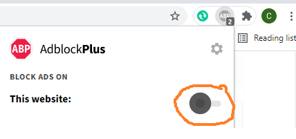
Đã phát hiện trình chặn quảng cáo AdBlock
Trang web này phụ thuộc vào doanh thu từ số lần hiển thị quảng cáo để tồn tại. Vui lòng tắt trình chặn quảng cáo của bạn hoặc tạm dừng tính năng chặn quảng cáo cho trang web này.